• All commemorative notes, except 2019 B200 $20 note
Microlettering is a security feature that uses extremely small printed text—so small that it looks like a thin line to the naked eye but becomes readable under high magnification. Because the letters are so fine and closely spaced, they are difficult to scan, photocopy, or reproduce with normal printing tools.
S2: BCCS in Full
S5: BCCS in Full
S100: BCCS in Full
S10000: BCCS in Full
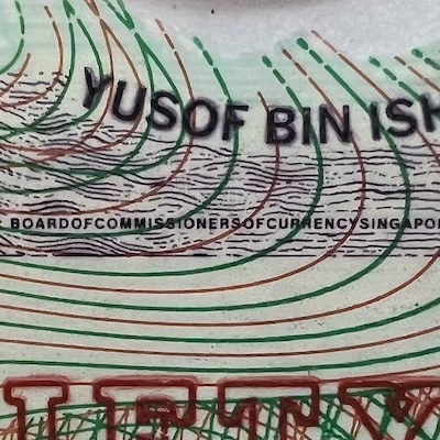
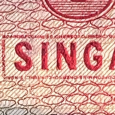
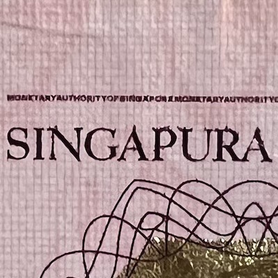
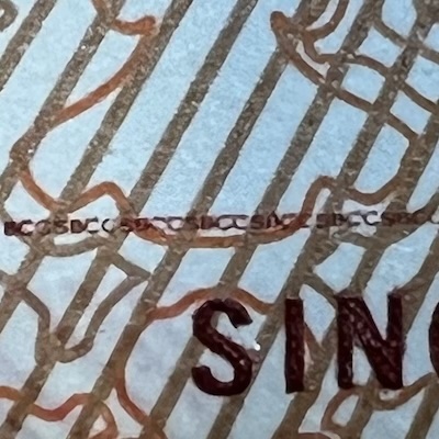
This feature was first used in the Ship series. The phrase “Board of Commissioners of Currency, Singapore” was printed in tiny letters above (or around, in the case of the $10000 note) the word “SINGAPORE” on the front of the note. Without a magnifying glass, it appears as a single line, but under close inspection, the words become visible. Microlettering was only added to Ship series notes issued from March 1987 onwards. Earlier notes—the $1000 note from 1984 and the $1 note from January 1987—did not have it.
P2: BCCS in Full
P100: BCCS in Full
P5: MAS in Full
P1000: MAS in Full
P5: BCCS in Full
P10000: BCCS in Full
P2: MAS in Full
P1000: National Anthem
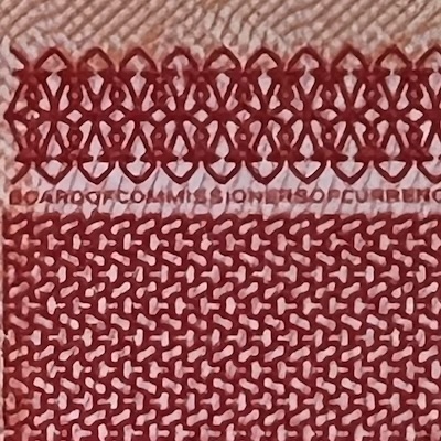
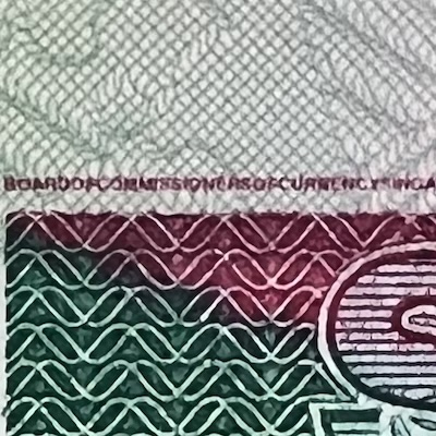
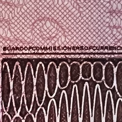
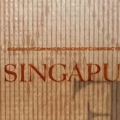
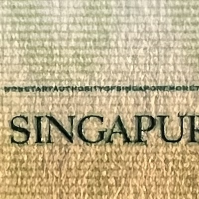
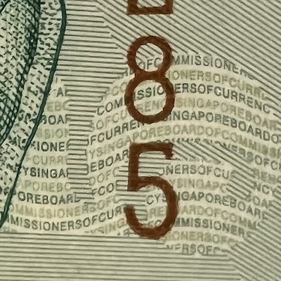
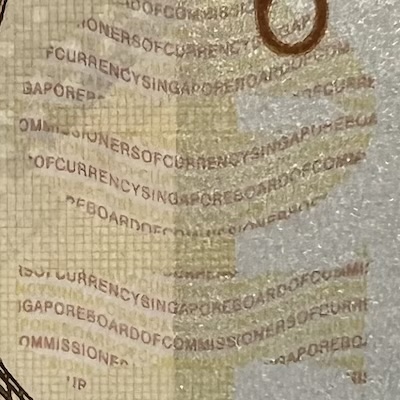
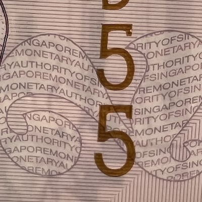
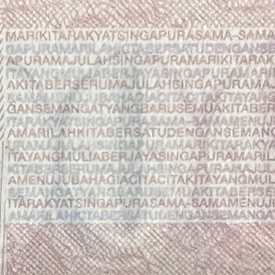
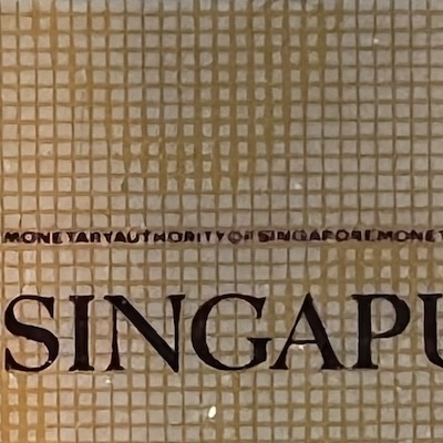
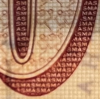
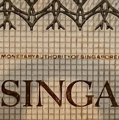
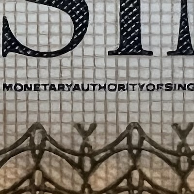
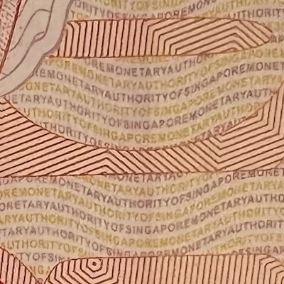
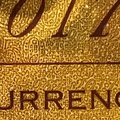
In the Portrait series, microlettering became a standard feature. It appears in two places. The line across the top edge of the note contains repeated microtext with the words “Board of Commissioners of Currency Singapore” or, for notes printed after 2002, “Monetary Authority of Singapore”. Microlettering is also hidden within the large, rotated denomination number next to the portrait. In addition, on the $1000 note, the entire lyrics of Majulah Singapura are printed in microlettering on the back.
SG25: BCCS in Full
MAS25: BCCS Abbreviated
CIA40: MAS in Full
CIA40: MAS Abbreviated
SG50-50: MAS in Full
SG50-50: MAS in Full
SG50-10: MAS in Full
CIA50: Milestone Numbers
Commemorative notes also used microlettering, except for the 2019 Bicentennial note. The notes generally followed the usual format—tiny rows of the issuing authority’s name. A few pieces, however, were different. The 1996 MAS25 $25 note shortened the issuing authority’s name to just “BCCS”. The 2007 CIA40 $20 concealed “MAS” within the shadow of its denomination number. The 2015 SG50 $50 had two rows of tiny text instead of just one, on the top and bottom of the note. And the 2017 CIA50 $50 note used microlettering with yet more sophistication, blending the tiny text—consisting of the milestone numbers “50”, “1967” and “2017”—into the background design rather than placing them in a straight line.
Disclaimer. I built this website as a hobby, to share with others what I’ve learnt. All the information here is written based on my own research and understanding, and I don’t guarantee that everything is correct, complete, or updated. While I sell banknotes here, I don’t profit from them, as they are spare pieces from my private collection. All the banknote images here are taken by myself and they belong to me. The non-banknote images, with sources that I’ve attributed on every page, are used solely for illustration and non-commercial education purposes. If you are a copyright holder and believe something has been used inappropriately, please contact me, and I will immediately review or remove it.