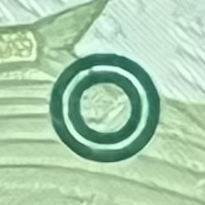
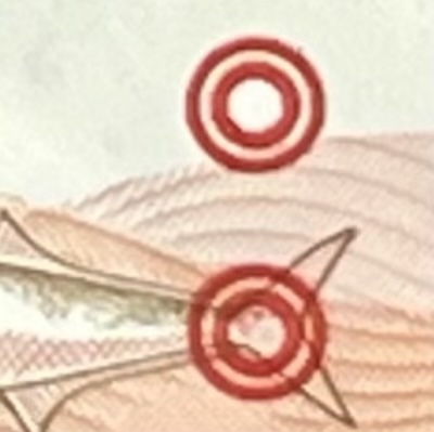
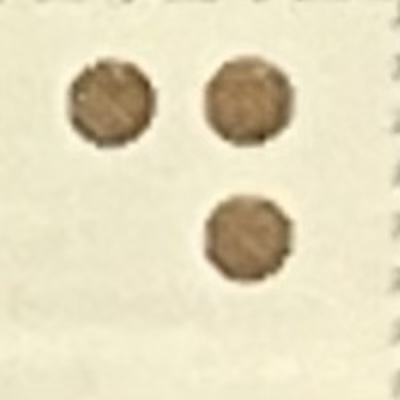
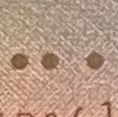
Tactile marks were added to Singapore’s banknotes to help visually impaired people tell the different denominations apart by touch. These raised features first appeared on the Ship series notes, where small circles were printed using intaglio ink in the bottom right-hand corner of most denominations. The number and arrangement of these circles—either one, two, or three—helped users identify the note’s value. There were no tactile marks on the $1 and $10000 notes, and later, also the $2 note, but these could still be recognised by their size, which were significantly smaller or larger than the rest. The raised circles on the Ship notes were not based on the Braille system and do not represent Braille characters—they were tactile markers specially designed for these notes.
S5
S10
S50
S100
S500
S1000
P2
P5
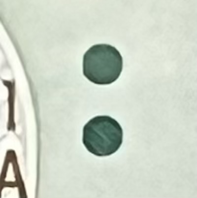
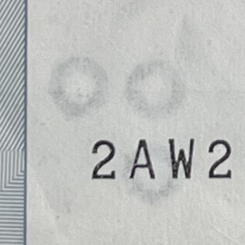
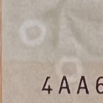
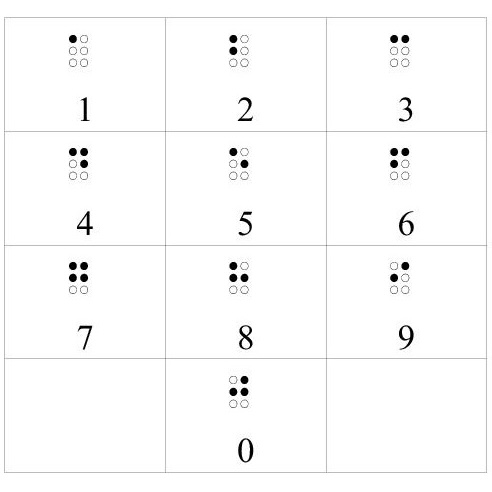
When the Portrait series was introduced, the tactile system was changed and expanded. Every note, from $2 to $10000, included raised dots in the top right-hand corner of the note’s front. These were no longer just a circle, but solid dots and arranged differently for each denomination—horizontally, vertically, or diagonally—making them easier to feel. Although these markings again look like Braille, they are still not standard Braille code. Instead, they follow a simpler system based loosely on Braille, where the number of dots shows the position of the note in the series. For example, the Braille code for 1 (represented by 2 dots) means this is the first note in the series—the $2. The Braille code for 5 (represented by two diagonally arranged dots) means that this is the fifth note in the series—the $100.
P10
P50
P100
P1000
CIA40
P10000
SG50-50
SG50-10
Commemorative notes followed the Portrait tactile system, except when the note had a denomination not found in the Portrait series—specifically, the $20 value in the 2007 CIA40 and 2019 B200 commemorative notes. For these, a special tactile pattern had to be created, which was a unique code not found on any standard Portrait note. The logic behind this pattern is not publicly explained, but some have suggested it might have combined existing tactile cues—two dots for $10 and one dot for $2—to represent $20. In general, all commemorative notes included tactile marks, with the exception of the 1990 SG50 and 1996 MAS25 notes, which were issued before the Portrait series and standardisation of the tactile markings.
CIA50
B200
P2
P5
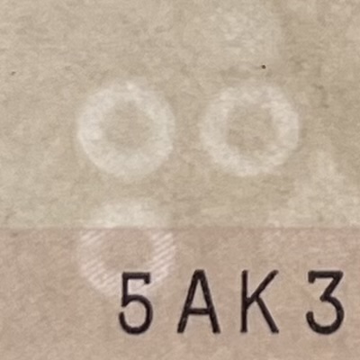
The same tactile mark patterns are also found inside the watermark on Portrait series notes. This watermark shows the same number and layout of dots as the raised ones on the note. However, this is not a recognition feature to help the visually impaired. Instead, it is an added security feature to make the note more difficult to counterfeit.
Disclaimer. I built this website as a hobby, to share with others what I’ve learnt. All the information here is written based on my own research and understanding, and I don’t guarantee that everything is correct, complete, or updated. While I sell banknotes here, I don’t profit from them, as they are spare pieces from my private collection. All the banknote images here are taken by myself and they belong to me. The non-banknote images, with sources that I’ve attributed on every page, are used solely for illustration and non-commercial education purposes. If you are a copyright holder and believe something has been used inappropriately, please contact me, and I will immediately review or remove it.